

I have here some works in progress, and one sketch from MICA that I dug up. I didnt think it was all that good until i looked back at it. I really like it now, so i decided to post it because it made me feel happy.
Im kind of bummed about my not being able to get a portfolio review from RISD, the seniors keep bumping me off the lists :( Sometimes they dont even tell me. * sniffle* anyway, i really look forward to my next review, this time maybe ill plan for it better.( I didnt know that they took down the lists to give to the reps so i just assumed it was cancelled and i didnt really have any good work to show the rep last time) Ive really begun to look more into concept, so for the piece with the crazy-slanted ground plane i did a psychoanalysis of sorts. Tried to use the implications of color as well as different textures. In the critique in class, they suggested that i not make the ground plane so annoying and to pay more attention to the direction of the marks. Nobody really liked the ground halo either so i have a lot of work to do this weekend *sniff* It was also suggested that i work bigger. PAUSE OK guise, heres the deal, MICHAELS WAS HAVING A SALE ON CANVASSES. i was just taking advantage of that :)
Im really reluctant to start working bigger because i often see other people's bigger work and its like...eh. I feel like i have more control over the events in the piece when its smaller. * sigh*
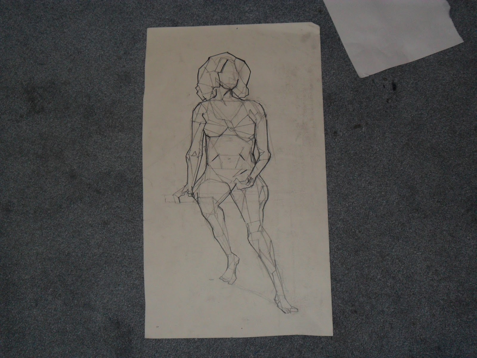
Alright, moving on, so this little sketch is another WIP for that project in ID that i was talking about earlier ( if anyones read this far, youre awesome, i love you) It will be one of hopefully three on this page. Im afraid that the figure is coming out too flat like i dont want her to look like a plane, i want her to look like she exists in space, but im having some trouble with that. We're designing a travel bag by the way, so its an airport and all that fun stuff. So anyway, the bag is not done. Once it is, i was hoping to extend the pink/orange/red into the bag too to show that it fits your personality no matter who you are. ( Thats the idea, to color code figures and bag based on their personality. ) Comment if youre into pac man tattoos!! ,
Im hoping that i can improve in that class. Ive been working really hard, but i know that i have a long way to go. Once I complete the two point that has been giving me so much grief ill post it. It's not that i havent finished it, its already been two weeks, come on! its that my final products are unsatisfactory and i think that i need to work on the way that i handle my pencil, especially with such technical drawings. if lines get too dark, then the final product is invisible, if lines are too light then i cant prove the existence of the final product. So its all a question of how much attention i pay to my lines. I think by the end of this my drawings skills will improve exponentially.
Pictures are up top if youre lookin' for 'em